City streets whisper safety through texture and rhythm: the smoothness of a crossing, the glow that softens pavement, the quiet cue of a line of posts. Design decisions made at street level define how people trust space—how they cross, pause, and linger. Comfort, in this sense, is not decoration but direction.
Small infrastructure choices—bollards, lighting, crossings, planters, and wayfinding—turn public life more than large-scale projects do. They set patterns that make movement predictable and perception calm. When these details are adaptive, cities remain flexible under shifting needs and budgets. Safety becomes a visible habit, built through simple gestures repeated with care.
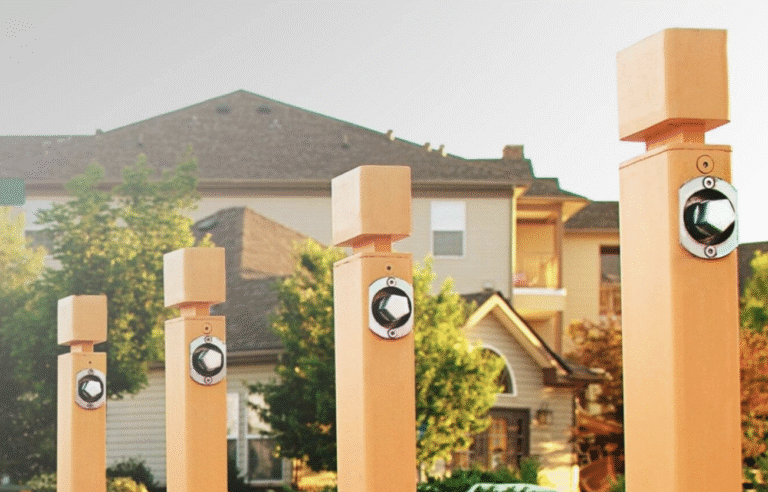
Collapsible Bollards That Adapt to Changing Urban Needs
Metal posts that vanish into the ground can transform a street’s rhythm within minutes. In thoughtful layouts, collapsible bollards let plazas, markets, and lanes adapt without clutter or permanence. When lowered, they open routes for events and gatherings; when raised, they return quiet order. Each cycle teaches flexibility, turning fixed surfaces into responsive civic tools.
Smart scheduling and sensory safeguards extend their usefulness. Timed retraction during deliveries, visual cues for operation, and maintenance checks keep movement predictable and trust intact. Design thrives on proportion—heads kept low for sightlines, mechanisms sealed against weather. Where hardware works cleanly, safety feels natural, and adaptability becomes part of daily routine.
Street Lighting That Focuses on Comfort, Not Just Brightness
A wet crosswalk glows under soft, even light, making curb edges and faces readable without sharp contrasts. Uniform color temperature across fixtures along a block reduces surprise shadows and helps peripheral vision pick up movement. Fixtures aimed downward, mounted at human scale, and fitted with full-cutoff shields cut glare for pedestrians while keeping drivers’ sightlines intact.
Regular maintenance keeps light quality steady; cleaning lenses restores output, aim checks reduce stray beams, and grouping lamp changes preserves uniform temperature. Photocells or simple timers prevent outages. Schedule lamp replacements every three years and lens cleaning quarterly to keep uniform light and limit glare.
Crosswalks and Intersections Designed for Predictable Movement
A crosswalk designed for clarity turns hesitation into flow. Wide zebra bands, textured pavers, or low raised surfaces cue both drivers and pedestrians to slow, see, and proceed with purpose. Consistent markings and curb ramps aligned with tactile paving improve accessibility for all users, including those with vision challenges. Every mark reinforces trust—movement feels guided rather than enforced.
Durability sustains safety. Reflective glass beads and anti-slip finishes preserve visibility in rain or dusk. When in-pavement LEDs sync to walk signals, they calm both foot and wheel traffic, creating rhythm at every approach. Crossings placed within sightlines of drivers and framed by clear signage reduce conflict points and near-miss incidents. Subtle shifts in timing—slightly longer pedestrian phases, balanced vehicle pauses—reduce stress without harming throughput. Predictable crossings make motion itself feel like part of the design.
Low Barriers and Planting Features That Guide, Not Block
Edges define experience. Low planters, curbs, and racks can guide movement without closing space. When kept below eye level, each element builds gentle rhythm along a path, shaping motion through presence rather than force. Materials that weather gracefully—Corten steel, smooth wood, or textured concrete—signal care and continuity between planted life and built surface.
Each boundary doubles as an invitation. Paired benches and planters form resting points that still permit sightlines across plazas. Consistent spacing maintains flow, while modest greenery softens transitions from street to square. Such design cues turn guidance into hospitality, showing that spatial order can emerge through balance, not barricade.
Wayfinding Systems That Simplify Movement and Reduce Confusion
Clear, consistent signs cut doubt at busy junctions and transit exits. Use uniform icons, legible sans-serif type and predictable placements at decision points: platforms, major intersections, plazas. Aim for 60 mm letter heights for pedestrian routes and mount maps at eye level (1.4–1.6 m) so people can glance without blocking flow.
Ground lines, footprint stencils and textured bands steer people to stops; use anti-slip reflective materials for low light. Keep sign clusters sparse and repeat key destinations every 100–200 m, showing simple walking times instead of distances. Add “You are here” panels at transit exits that mark 5-minute walking radii.
Safety in cities grows from the rhythm of repeated care—posts that fold away at dawn, light that steadies the rain’s glare, crossings that slow the rush into shared movement. Each detail teaches trust between people and place. These elements turn planning into practice, maintenance into quiet ritual. They are not cosmetic but civic, proving that design’s smallest gestures preserve the freedom to walk, pause, and belong. When a plaza, market, or crosswalk feels naturally safe, it reflects coordination between planners, crews, and citizens who notice. True progress appears not in barriers removed, but in confidence restored to ordinary movement.
0 Comments