When a brand chooses to be more than just a promise, what happens? When your identity feels like a shore, you can visit — a canyon that whistles at dusk, a neon forest that only blooms at dawn — you stop selling products and start inviting people into an atmosphere. If you want to seed that feeling quickly, try sketching dozens of emblem options with an AI logo generator to get surprising glyphs that echo landscape features (arches, ridgelines, mists). As an innovative AI generator, Dreamina becomes your studio for transforming those embryonic marks into full-bodied identities that subtly evoke imagined weather.
This essay is an invitation to think of logo design as cartography: we’ll explore how surreal, generated landscapes give you metaphors, palettes, and patterns to build emblems and wordmarks that feel like entire worlds. You’ll get practical ways to mine AI outputs for symbolic elements, simple systems for translating texture into type, and a short Dreamina workflow that moves you from a dream-plate to a usable brand asset. With Dreamina’s strong text-to-image feature, you can expect crisp paragraphs, a small set of bullets for quick reference, and playful prompts you can actually try tonight.
The affordances of landscape-based branding
Landscapes tell stories fast: a cliff suggests endurance, a foggy vale implies mystery, and a tilted horizon can feel restless. When you root a logo in landscape imagery, you inherit those narrative shortcuts. A world-inspired emblem does three things simultaneously: it anchors feeling (the mood of place), it provides visual vocabulary (rocky textures, layered horizons), and it offers scale-play (tiny glyph or sweeping mural). The trick is to distill: find one elemental gesture in the landscape that can survive being shrunk to a favicon and enlarged to a mural.
How to mine surreal images for logo DNA
Strange features abound in AI-generated dreamscapes, such as a tree with spiralling branches that resemble shells, a river with metallic reflections, and a coral cliff that resembles folded paper. Treat these details as logo DNA. Scan generated images and ask: which recurring motif repeats across many images? Which small form would still be legible at 32 pixels? Keep three extraction moves in mind:
-
Isolate silhouettes, which are visible even in dim light.
-
Simplify textures into strokes or hatch patterns
-
Convert repeating geometry into pattern tiles
From each image, you should be able to extract at least one shape that can become a glyph, and one texture that can become a background or print surface.
Building a coherent mark system from a dream
A logo born from a dream needs a family: a primary emblem, a simplified glyph, a wordmark treatment, and a secondary pattern. Start with the emblem’s silhouette — the shape everyone will remember. Then create a glyph by reducing that silhouette to its most essential angle or loop. The wordmark should echo the emblem’s rhythm: if the landscape felt jagged and staccato, choose a letterform with pointed terminals; if it felt foggy, choose softer counters and generous spacing.
Design rules matter: define a minimum clearspace (usually tied to a unit of the glyph), a single accent color drawn from the landscape, and a texture usage guide (where to use the hatch versus a flat color). These constraints let the identity be evocative without collapsing into inconsistency.
Texture-to-type translations
Surreal landscapes often provide textures—salt flats, oil-slick water, chiseled stone. Translate these into typographic decisions. Rough stone suggests a slab serif; oil-slick sheens call for a subtle gradient in the headline color; mist maps to low-contrast weights and increased line spacing. Keep accessibility in mind: texture is an enhancer, never a substitute for contrast.
If you’re experimenting with surface treatments for packaging or merch, use a sticker maker to print small tactile proofs — translucent stickers for misty elements, chrome foils to suggest metal rivers, or soft-touch vinyl to evoke mossy banks. Tiny physical proofs help you judge whether a texture reads as intended in the real world.

Building narrative color systems
Colors in dreamscapes rarely read like standard brand palettes. You might find a sky that is a bruised purple with a vein of citrus, or a dune whose highlights flash teal. Instead of forcing names like “primary” and “secondary,” build a palette with narrative roles: horizon (the base tone), weather (mood modifiers), and highlight (surprise accents). Use the horizon tone for large surfaces, weather tones for photography overlays, and highlight for interactive elements like CTAs or badges.
Short playbook for wordmarks that feel like places
Design a wordmark as if it were a sign in the landscape. Consider these small moves:
-
Letter spacing as topography: denser spacing feels compressed like canyon walls
-
Terminals as topographical marks: hooked terminals imply joinery or roots
-
Baseline modulation: slight rises and dips in a wordmark can mimic undulating ground
These are subtle, but together they make the word feel like it belongs in the world it names.
Prototyping visual language with generated scenes
If you want to audition materials and compositions quickly, a lightweight pass with Dreamina’s AI photo generator can give you diverse, unexpected landscapes to pull motifs from: crystalline coasts, mossed arches, and metallic skies. Use those images to assemble mood grids and to show stakeholders how the emblem will exist within texture and context—on a website hero, on a tote bag, or as a storefront window.
Short checklist for scale-readiness
Before finalizing, validate these points: silhouette clarity at 16–32 px, contrast in monochrome, pattern repeats at tile size, and legibility on textured backgrounds. If one item fails, simplify until it passes.
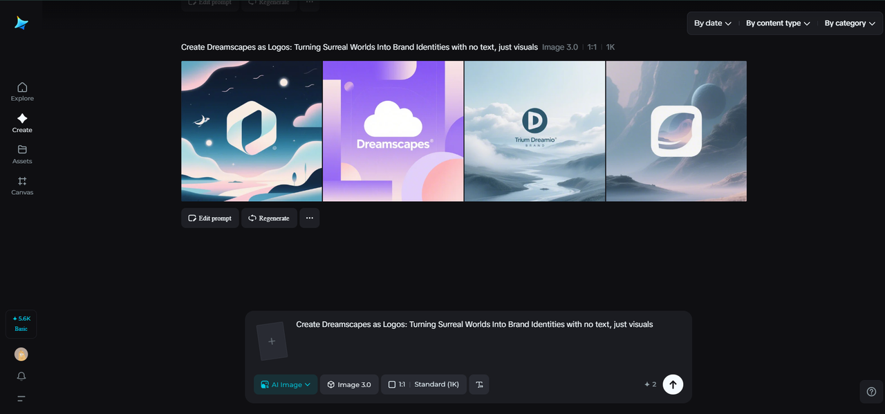
Dreamina’s atelier: turning dream-plates into brand-ready assets
Making sense of images has never been easier. Here are three simple steps, so now it’s time for you to go do some research and have some fun exploring Dreamina and generating images!
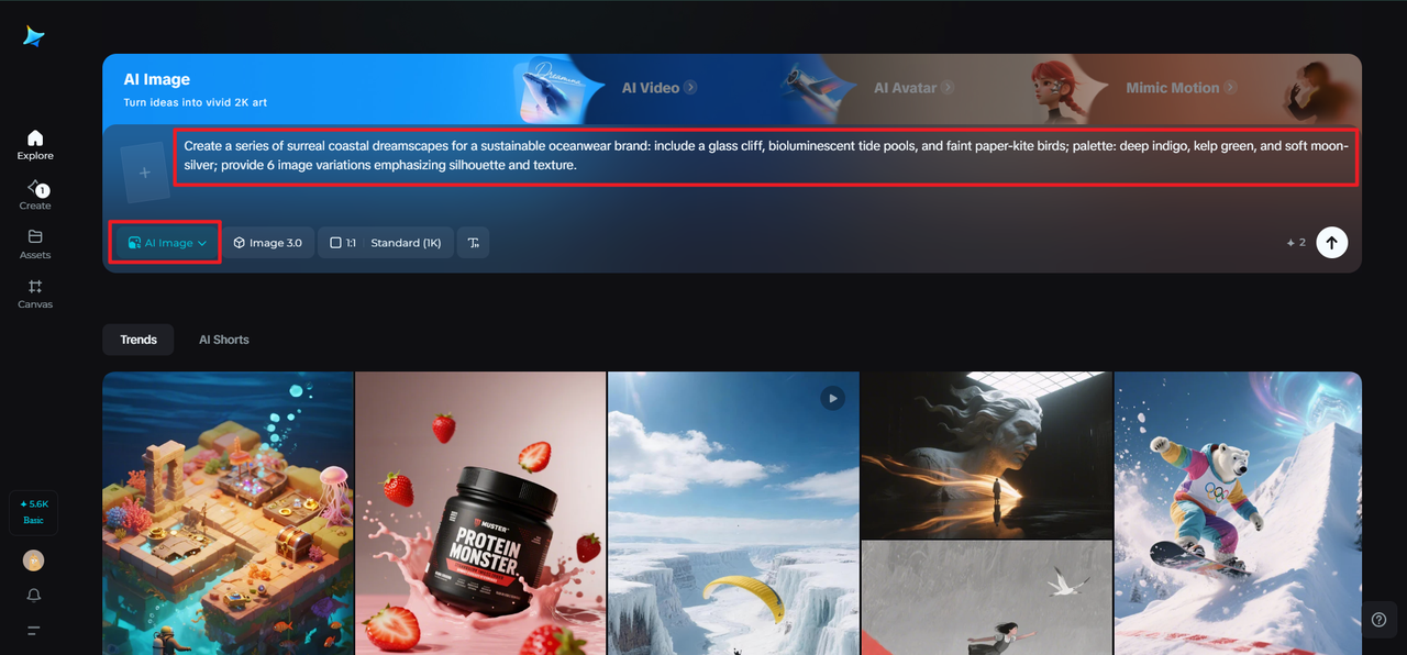
Step 1: Write a description text prompt
In Dreamina, write a precise prompt that specifies a surreal landscape emphasizing clear motifs and mood. You need to be precise and relatable about materials and the mood of what you want Dreamina to draw image cues from.
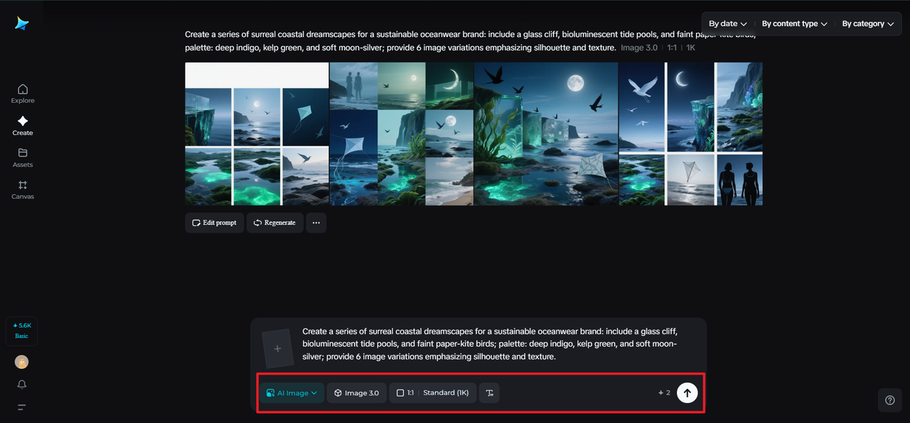
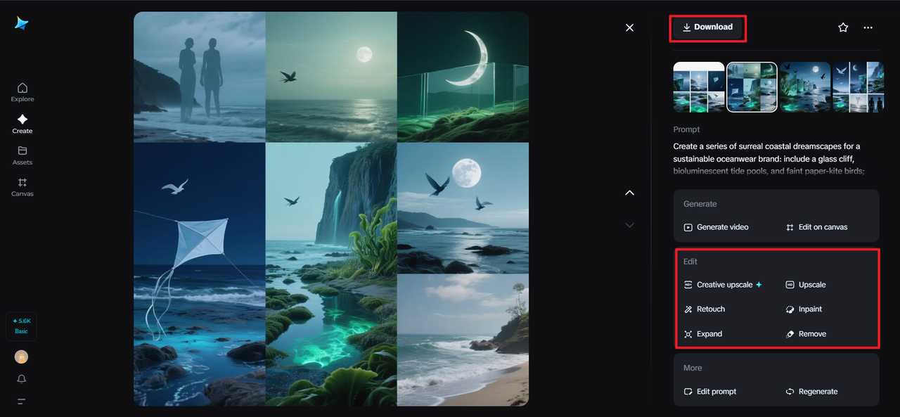
For example: Create a series of surreal coastal dreamscapes for a sustainable oceanwear brand: include a glass cliff, bioluminescent tide pools, and faint paper-kite birds; palette: deep indigo, kelp green, and soft moon-silver; provide 6 image variations emphasizing silhouette and texture.
Step 2: Change settings and make an image
Choose a model optimized for high-detail textures, and then decide on an aspect ratio based on your needs for output (square for glyph exploration or landscape for hero imagery) and then size and resolution (1k for fast conceptual image generation and 2k for detailed texture reads). After that, click on the Dreamina icon to create several options. Review the generated products, looking for repeatable shapes and exciting textures to distill into a motif for your brand.
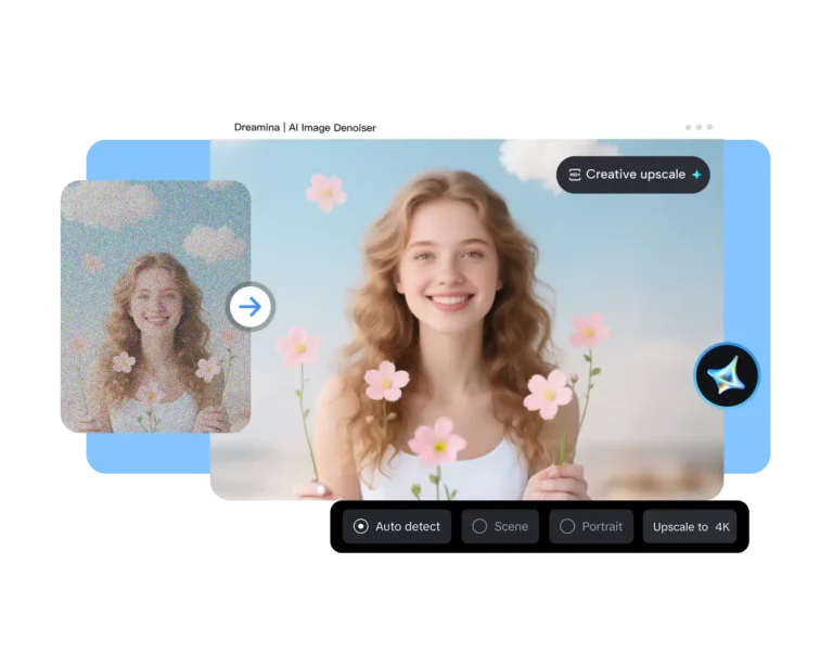
Step 3: Edit and download
Through the creative upscale, inpaint, expand, remove, and retouch toolkit, you can clarify silhouette shape, expand compositions into brand mock-ups, remove distracting artifacts, and retouch colors to enhance harmony. If an image produces a compelling motif and texture, then once you feel you are close to finishing the image, click on the Download icon and save the high-resolution files.
Last thoughts— the brand that feels like a visit
Brands that borrow geography from surreal image generators invite deeper attention, as they are places people can revisit again and again in snapshots, submarks, and tactile proofs. Dreamina accelerates that process by turning mood into visuals you can interrogate, extract, and refine. Generate richly, distill patiently, and always test in the wild. When a logo finally feels like a true landscape — something people can return to in their heads — you’ve done more than design identity; you’ve created a destination.
0 Comments